These Images Will Take Your Personal Brand Website Launch to New Levels!
Introducing your brand to the world is a big deal. And when it comes to a personal brand website, a cohesive look with professional, intentional brand images is one of the best investments you’ll ever make. Professional brand images scream “I’m an expert!” “You should trust me!” and (in our opinion) “I’m kind of a big deal! Respectfully.” If you’re thinking one headshot is all you need to go from zero to 6 figures, this blog post is for you!
When you’re planning your website branding session, you’ll want to consider creating images for your home page, about me page, services page, pricing page, contact page, and even some of your back end pages that people may only see after inquiring with you.
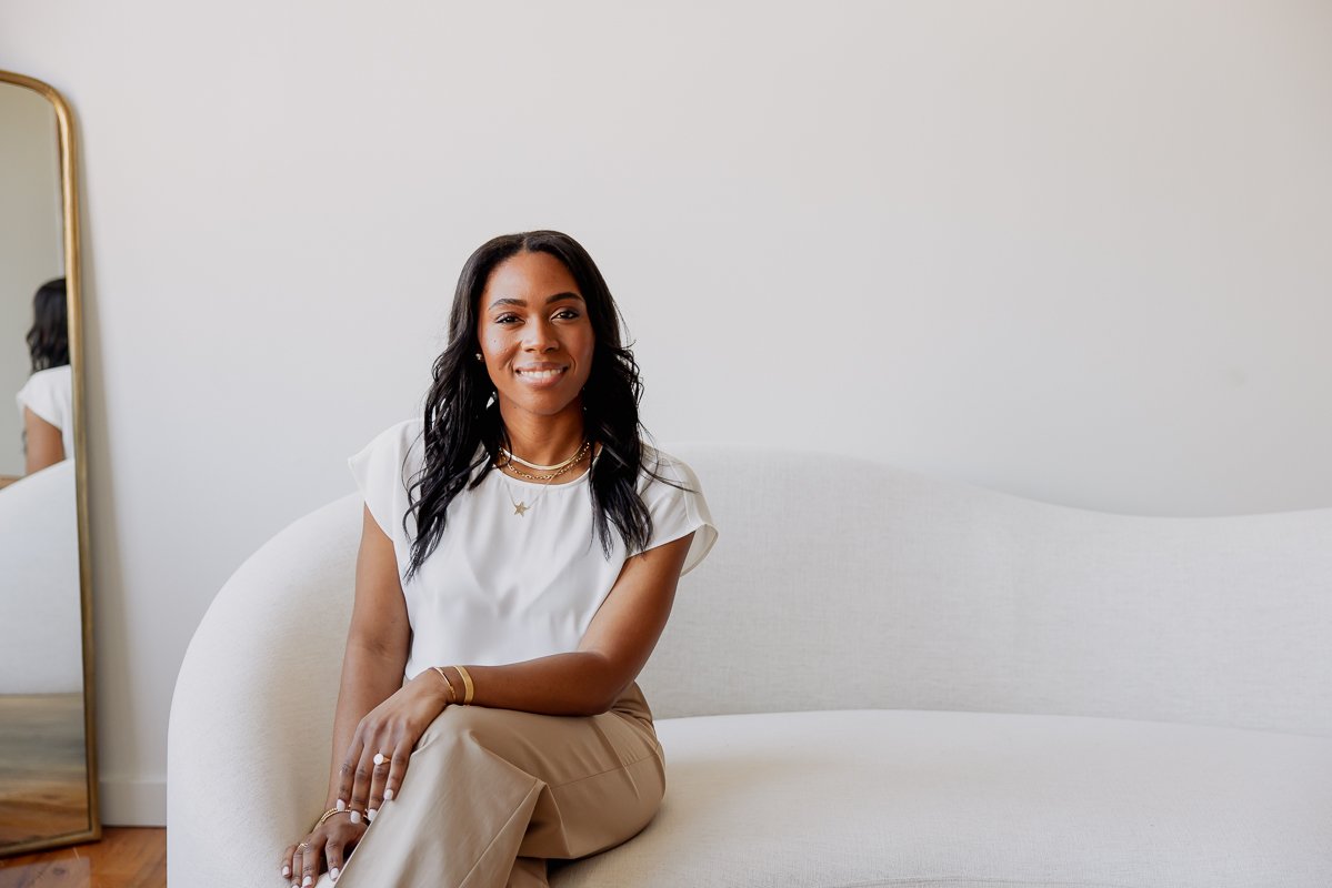
Here are a few images we love to shoot for our branding session clients when they let us know they are launching or re-launching their personal brand website (and why!) featuring Audris Campbell.
Shot List Must #1: Lifestyle Images
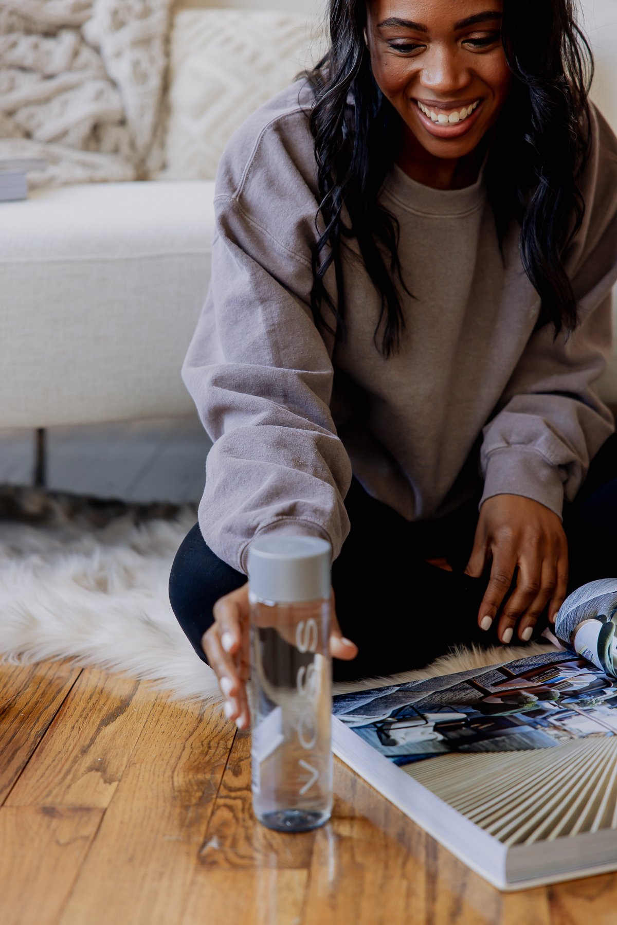
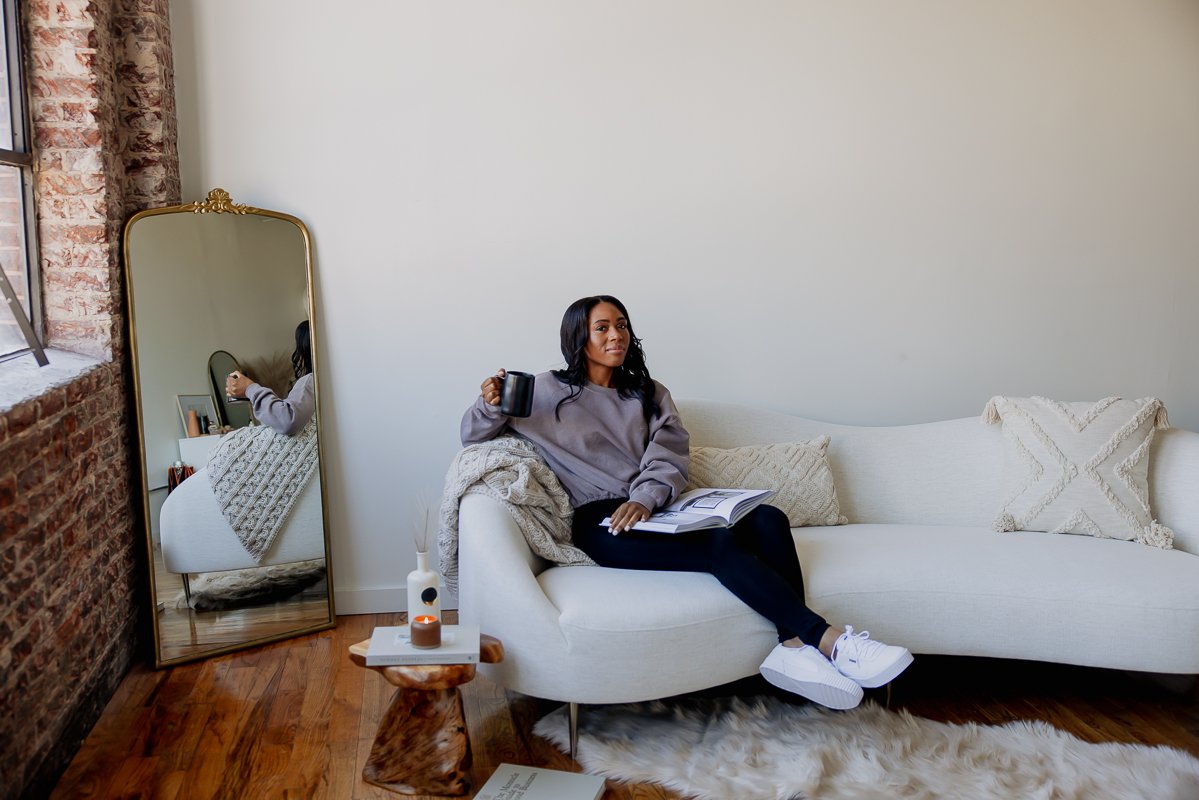
Every photographer is not specifically a LIFESTYLE photographer, but if you’re a service-based boss it is recommended that you book a lifestyle branding photographer specifically. Why? Because when you are the face of your brand, its important to show your audience who you are and what you do in a non-used-car-salesman kind of way. And a lifestyle branding photographer may be more versed in this style of imagery a little more than an interior homes photographer for example. Simple lifestyle images where you are ‘in action’, either from a work or leisure perspective, brings in that human dynamic that your audience is looking to connect with. Connection leads to trust and trust leads to sales. Think of lifestyle images as a behind-the-scenes look into your life.
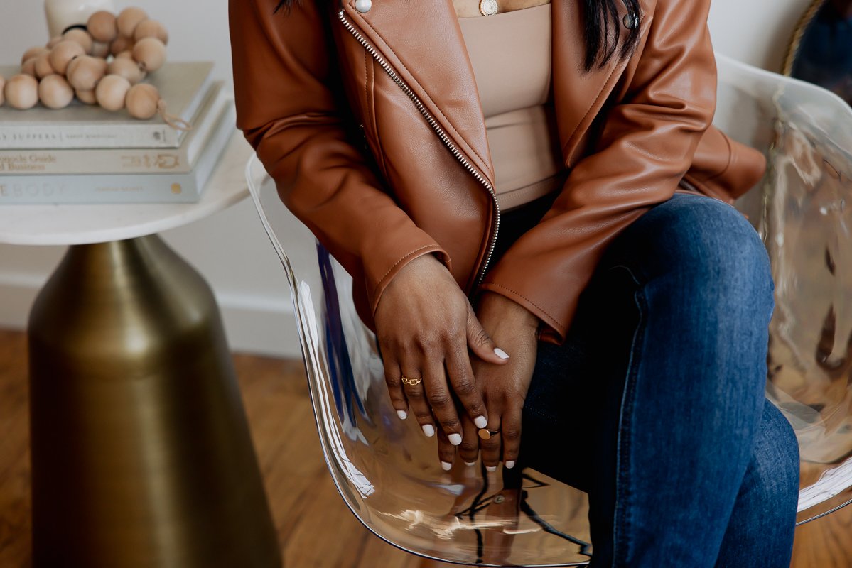
Shot List Must #2: Detail Images
You don’t need to be in every image on your personal brand website. Detail shots are a great way to incorporate your services or interests in a curated way that saves you from having to upload stock photos that don’t match your other brand images. They’re also great for banner images, and images where you’d want to add text or buttons over them. Detail shots are like your own personal stock photo gallery!
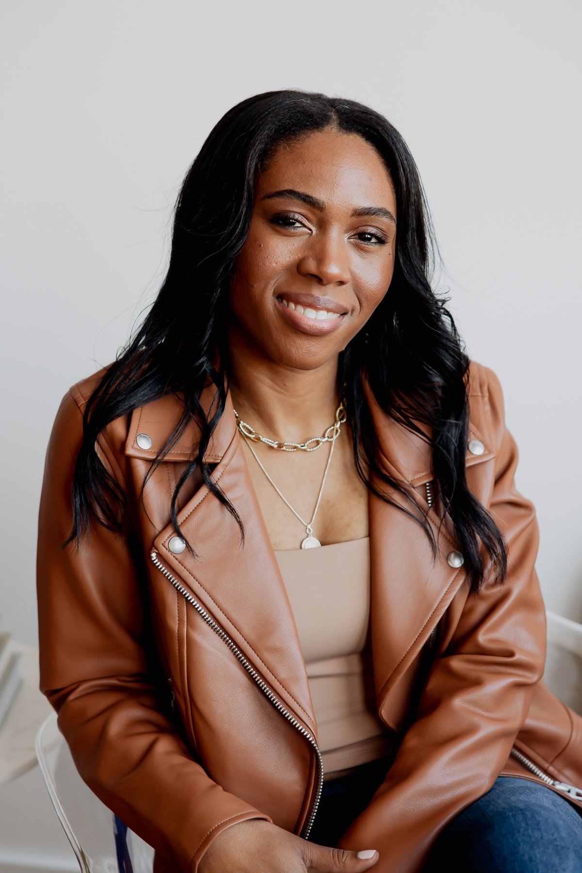
Shot List Must #3: Creative Portraits
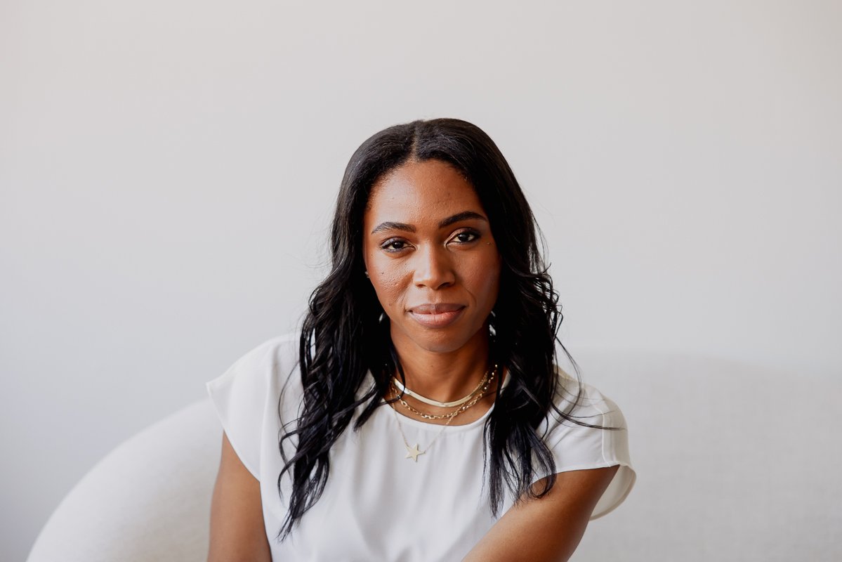
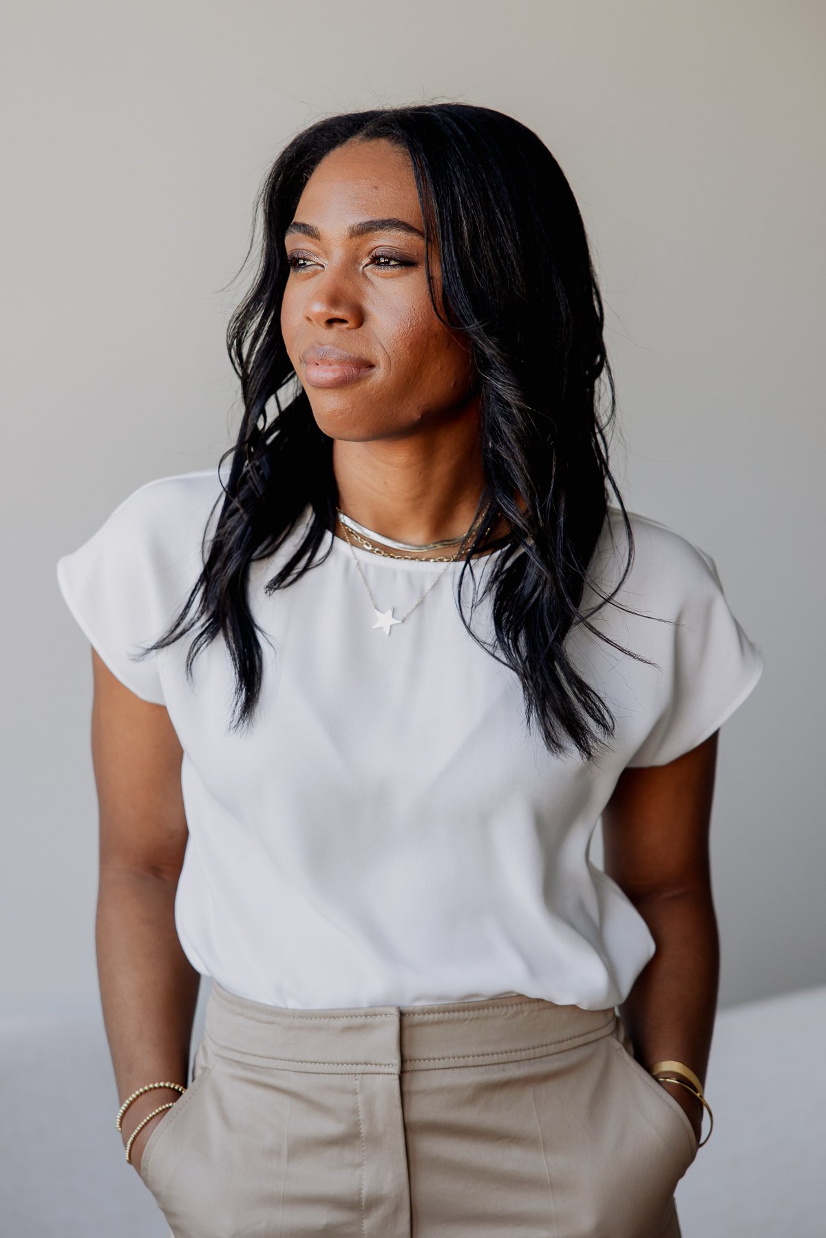
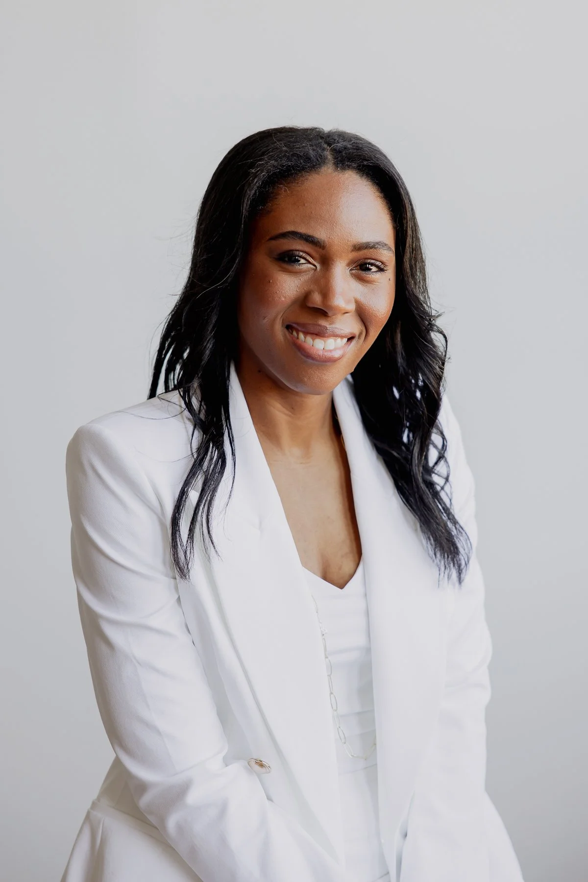
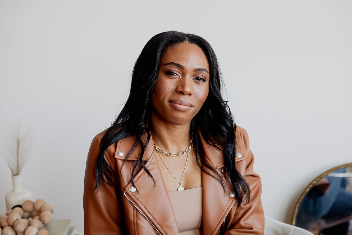
Creative portraits are our jam! Traditional headshots are great for LinkedIn, but creative portraits are where your brand’s soul lives. Try to throw both smiling and more serious looks at your photographer, for a good mix of creative portraits to work with.
Shot List Must #4: Headshots
A traditional headshot is tried and true. You can never go wrong with throwing a traditional headshot in the mix, even for a creative branding session. Traditional headshots can be used for ‘official’ bio requests that you might pass on for speaking engagements, media opportunities, podcast episode announcements, etc.
Shot List Must #5: A Healthy Mix of Horizontal + Vertical Images
Your branding session should include a good mix of both horizontal and vertical shots. In the age of Instagram, influencers have created a demand for vertical images because they look better ask you are scrolling through your feed (because they fit perfectly into the shape of your phone). However, horizontal images are used more often on websites, you guessed it, because they match the shape of your computer screen. You’ll still want a combo of both per look or ‘scene’ for various reasons, such as how we’ve stacked the images throughout this blog post.
Shot List Must #6: Negative Space/Off-Center Images
If you’re not a website designer, this may never cross your mind, but we think website designers will agree. It’s a great idea to get some images with plenty of negative or white space during your branding session for moments when you want to add copy or text over them later. The negative space will allow your copy or text to be clearly read by your audience no matter the font size.
Want to see Audris’ full Ultimate Branding Session? Check it out here!
Images by Lead Photographer Kelley Raye


